Shopify Product Image Size Guide: Maximize Visual Impact
May 10, 2025
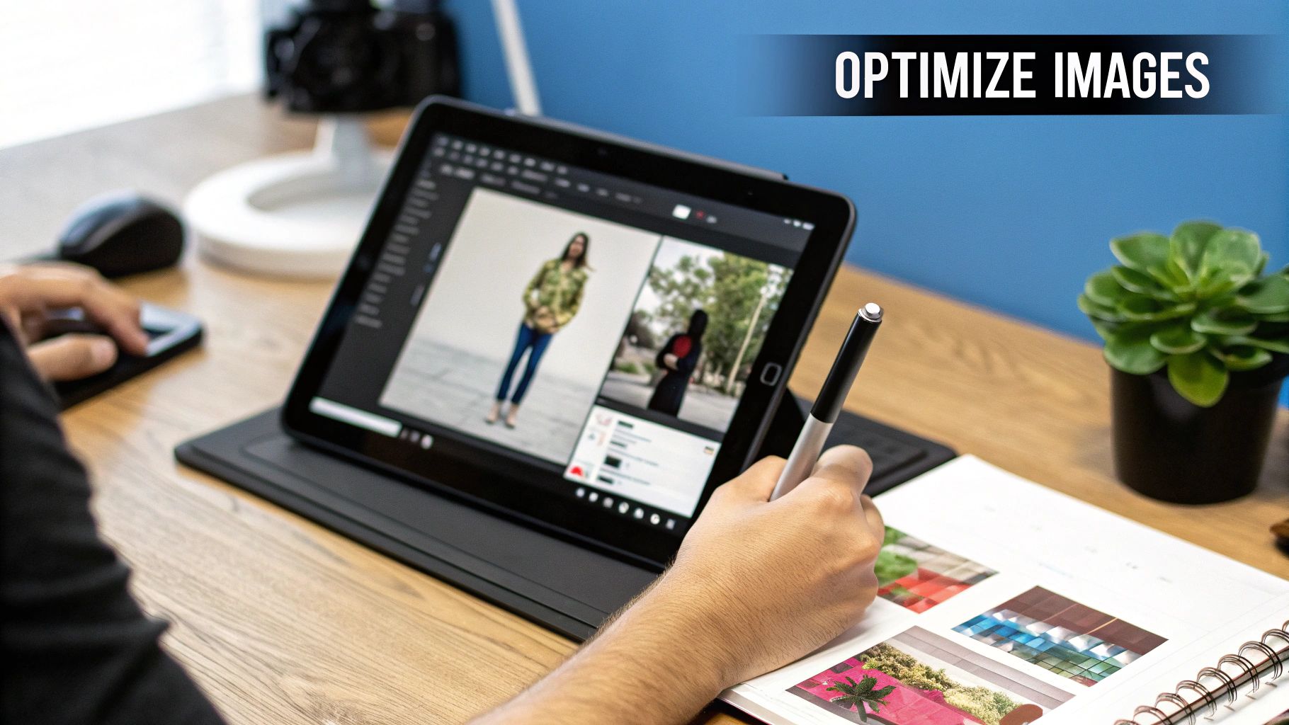
Cracking the Shopify Image Size Code
Understanding Shopify product image sizes is key for a successful online store. It's about more than just aesthetics; the right dimensions contribute to a smooth and engaging customer experience. This translates directly into higher conversion rates and a stronger brand presence.
Why Shopify Image Size Matters
Image size affects several crucial elements of your Shopify store. Zoom functionality, for instance, relies on high-resolution images. Customers want to see the details, and a large, clear image lets them zoom in without encountering pixelation. This builds trust and encourages purchases.
Another critical factor is mobile responsiveness. Optimized images load quickly on mobile devices. This prevents frustration and keeps customers engaged, reducing the likelihood of abandoned carts. Site speed also plays a role in how search engines like Google rank your store.
Historically, Shopify product image size handling has evolved. Currently, Shopify supports images up to 5000 by 5000 pixels with a 20 MB file size limit. However, the recommended size for square product images is 2048 by 2048 pixels. This balance offers optimal display and zoom capabilities. Learn more: Shopify Image Sizes.
Decoding the Dimensions: A Practical Guide
There's no single "perfect" Shopify product image size. The ideal dimensions depend on your products and your chosen theme. However, these guidelines provide a solid starting point:
-
Square Product Images: Aim for 2048 x 2048 pixels. This provides excellent zoom quality and a consistent look across your product catalog.
-
Collection Images: Consider slightly smaller dimensions, like 1024 x 1024 pixels, for collection images. This can improve page load speed without compromising visual appeal.
-
Banner Images: These usually have a wider aspect ratio. Experiment with sizes around 1200 x 400 pixels or 2048 x 1152 pixels to see what works best for your theme.
Further reading: Understanding the benefits of Shopify.
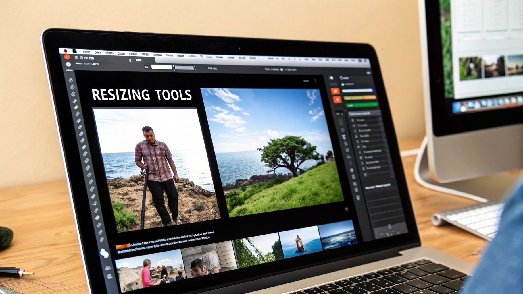
Optimizing for Success
Just uploading large images isn't enough. You also need to optimize them for performance. This means balancing high-resolution visuals with manageable file sizes. Explore further on mobile optimization and how to increase sales on Shopify.
-
Compression: Tools like TinyPNG can significantly reduce file sizes without a noticeable loss in quality. This is crucial for fast loading.
-
File Format: JPEG is typically best for photographs, while PNG suits graphics with transparency. Explore newer formats like WebP for enhanced compression and quality.
-
Alt Text: Always use descriptive alt text. It improves accessibility and helps search engines understand your images, benefiting your SEO.
By understanding Shopify product image size best practices, you can create a visually compelling and high-performing online store that attracts and converts customers.
Theme-Specific Image Strategies That Convert
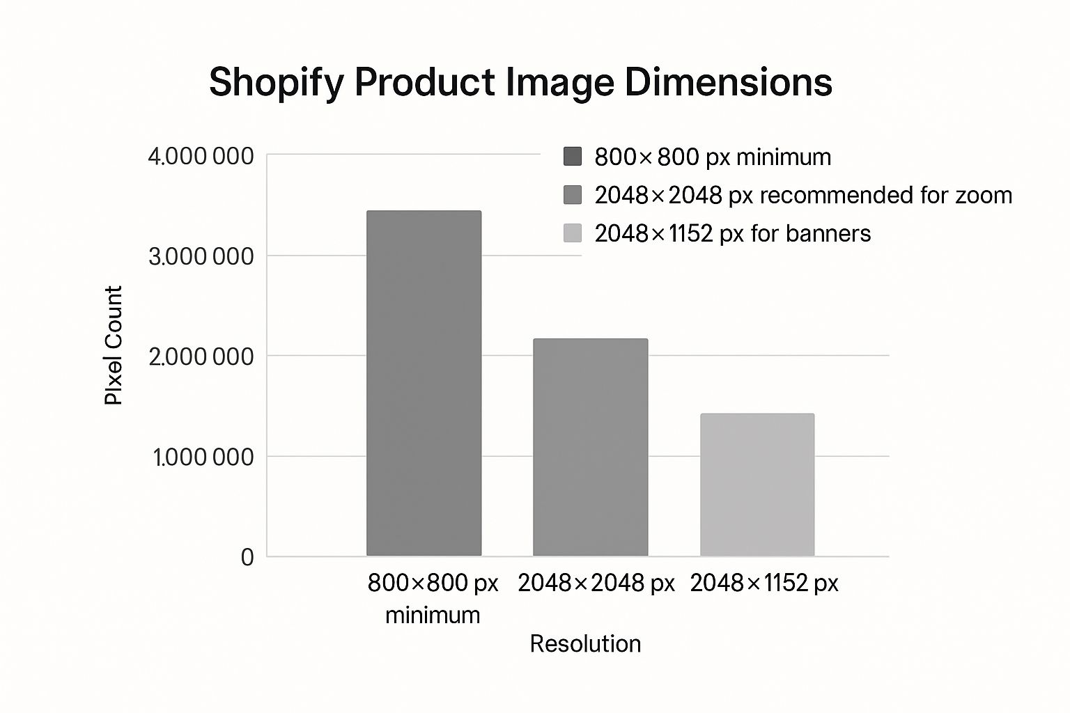
The infographic above compares common Shopify product image dimensions: 800×800 pixels (minimum), 2048×2048 pixels (recommended for zoom), and 2048×1152 pixels (suggested for banners). The increasing pixel count with larger dimensions impacts file size and, consequently, page load speed. Choosing the right dimensions for each image type balances visual appeal with website performance.
Picking the right Shopify product image size for your theme is essential for boosting conversions. Different themes display images differently, affecting customer perception. A theme designed for large images may not display smaller images well, creating a less engaging experience.
Conversely, a theme built for smaller images might crop larger ones unexpectedly, potentially misrepresenting your products. The optimal image size for your Shopify store depends on factors like your theme and the image's purpose. For example, square product images are best at 2048×2048 pixels, while collection images are often ideal at 1024×1024 pixels to maintain a square aspect ratio and avoid cropping. Learn more about ideal Shopify image sizes.
Adapting Your Images to Popular Themes
Many popular Shopify themes have unique image displays, requiring specific optimization approaches.
-
Themes with Prominent Zoom Features: These themes benefit from large, high-resolution product images (2048×2048 pixels) for crisp detail when zoomed.
-
Themes with Grid-Based Product Displays: Consistent Shopify product image size and aspect ratio are critical here. Variations disrupt the grid, making it look messy.
-
Themes with Large Banner Images: Ensure banners are high-resolution and correctly sized for the theme's banner area. Experiment to see what works best.
You might also find this helpful: How to master Shopify conversion optimization.
To illustrate the importance of image size optimization for different themes, let's look at some recommended dimensions:
To help you visualize these differences, take a look at this table:
Recommended Image Sizes by Shopify Theme
A comparison of optimal product image dimensions across popular Shopify themes
| Theme Name | Product Image Size | Collection Image Size | Banner Image Size | Special Considerations |
|---|---|---|---|---|
| Theme A (Example) | 2048 x 2048 px | 1024 x 1024 px | 2048 x 1152 px | Supports zoom feature, prioritize high-resolution images |
| Theme B (Example) | 1024 x 1024 px | 512 x 512 px | 1920 x 500 px | Grid-based layout, maintain consistent aspect ratio |
| Theme C (Example) | 1200 x 1200 px | 600 x 600 px | 1600 x 900 px | Full-width product display, crop images carefully |
This table shows how image sizes can vary depending on the theme's layout and features. Matching your image sizes to your theme ensures a polished and professional online store.
Testing Your Images Across Themes
Testing images across different themes prevents costly redesigns later.
-
Upload Representative Product Images: Choose images showcasing various shapes, sizes, and details.
-
Preview Across Different Themes: Install and preview themes with these images, checking how they are cropped, resized, and displayed.
-
Evaluate Zoom Functionality: Test zoom with high-resolution images to ensure clarity.
-
Assess Mobile Responsiveness: View images on various mobile devices to confirm they load quickly and display correctly.
By understanding how Shopify product image size interacts with themes and thoroughly testing, you ensure a visually appealing and consistent brand experience that drives conversions.
Speed Vs. Quality: Finding Your Perfect Balance
The classic ecommerce dilemma: stunning product images or lightning-fast loading speeds? You don't have to choose. For a truly positive customer experience and better conversions in your Shopify store, you need both. It all comes down to finding the right Shopify product image size.
The Impact of Image Optimization
Image optimization has a direct impact on important metrics like abandonment rates and session duration. Slow-loading images can frustrate customers, leading to higher bounce rates. On the other hand, high-quality images that load quickly encourage browsing and engagement. This directly impacts your bottom line.
Imagine a customer browsing your products on their phone using limited data. A large, unoptimized image could take a long time to load, potentially causing them to give up on the purchase. A well-optimized image, even with a slightly lower resolution, loads quickly, keeping the customer engaged and interested.
Compression Techniques for Shopify Product Images
Several compression techniques can significantly reduce file sizes without noticeably impacting visual quality. It's similar to packing a suitcase efficiently—you can fit the same amount of clothes with strategic folding and organization.
-
Lossless Compression: This method removes unnecessary data without affecting image information. It's perfect for images with sharp lines and text, like logos. TinyPNG is a great tool for this.
-
Lossy Compression: This technique achieves smaller file sizes by discarding some image data. This is generally suitable for photographs where a small reduction in quality is less noticeable. JPEG is a common example.
Next-Gen Image Formats: WebP and AVIF
Next-generation image formats like WebP and AVIF offer superior compression and quality compared to traditional JPEGs. They provide more detail with less bandwidth.
-
WebP: Developed by Google, WebP offers both lossless and lossy compression. It often creates smaller file sizes than JPEG with comparable quality.
-
AVIF: AVIF provides even better compression than WebP, leading to smaller file sizes and faster loading times.
Implementing these formats requires some technical know-how, but the payoff in store performance is substantial. For more optimization tips, check out our guide on driving traffic to your Shopify store.
Responsive Images: Adapting to User Devices
Responsive images adjust to the user's device, ensuring the optimal display on different screens. This means you deliver the right Shopify product image size based on the user's screen size and resolution, creating a better browsing experience and faster loading times.
This approach is especially important with the growing number of mobile shoppers, as it avoids loading large desktop images on smaller devices, improving mobile performance significantly.
Creating a Visual Language Through Consistent Dimensions
Maintaining consistent Shopify product image sizes across your online store is key for a strong brand identity and a smooth shopping experience. Think of your website like a physical store: neatly arranged, identically sized products create a clean, organized look. Inconsistent sizing, however, can feel cluttered and unprofessional, potentially deterring customers.
This visual consistency builds trust and encourages customers to explore your products further.
Establishing Dimensional Consistency
Top Shopify merchants understand the importance of visual consistency. They set specific image dimensions for various product categories. For example, apparel images might be 2048 x 2048 pixels, while accessories could be 1024 x 1024 pixels. This consistency, even across different product lines, elevates their brand image.
This attention to detail creates a professional and trustworthy impression. Imagine a website with a mix of small, blurry images and large, high-resolution ones. This inconsistency can make a brand seem less credible.
Transforming Browsing Experiences
Standardized Shopify product image sizes significantly improve the browsing experience. Comparing examples of inconsistent versus consistent image sizes clearly demonstrates the impact. A page with varying image sizes feels chaotic and unprofessional. Conversely, a page with consistent dimensions looks clean, organized, and appealing, encouraging longer browsing times. Learn more about building a consistent brand in our article about How to master brand guidelines for social media.
Workflows for Efficient Processing
Using consistent Shopify product image sizes requires efficient workflows, especially for large image libraries. Many successful stores use batch processing tools like Adobe Photoshop to quickly resize and optimize numerous images. This automation saves time and resources.
Quality control is essential. Previewing changes before applying them ensures all images meet your standards and helps maintain a consistent look across your store.
Handling Problematic Products and Maintaining Consistency
Some products, due to their shape or size, might not fit perfectly within standard image dimensions. A long necklace, for example, might not fit well in a square format. Strategic cropping or using white space can help maintain a consistent look.
To illustrate optimal dimensions for different products, consider the following table:
Optimal Image Dimensions by Product Category
Recommended image sizes and aspect ratios for different types of products
| Product Category | Ideal Image Size | Aspect Ratio | Background Type | Key Considerations |
|---|---|---|---|---|
| Apparel | 2048 x 2048 pixels | 1:1 | White | Ensure full product is visible |
| Accessories | 1024 x 1024 pixels | 1:1 | White/Light Gray | Focus on details |
| Footwear | 1500 x 1500 pixels | 1:1 | White | Showcase from multiple angles |
| Electronics | 1200 x 1200 pixels | 1:1 | White/Black | Highlight key features |
| Home Decor | 1800 x 1800 pixels | 1:1 | Contextual | Show in a room setting |
This table provides a starting point for establishing your own image guidelines. Remember to adjust based on your specific products and brand aesthetic.
As your product catalog grows, maintaining consistency becomes even more important. Establish clear guidelines for Shopify product image sizes and train your team to adhere to them. Regularly reviewing and updating these guidelines will help maintain a consistent visual language as your store expands.
Beyond Basics: Advanced Image Optimization Tactics
Optimizing your Shopify product image size is essential. However, it's just the first step. To truly make your visuals shine, you need to go further. Think of it like professional photography: getting the right size is important, but the real magic happens in the editing. Similarly, Shopify's advanced features can take your product images to the next level.
Leveraging Shopify's Built-In Image Transformations
Shopify offers built-in tools to resize and edit images. These image transformations mean you don't need to rely on other apps. It's like having a mini photo editor right inside your Shopify dashboard. Many top Shopify stores use these features to ensure their images look polished on any device.
- Automatic Cropping: This helps your images fit perfectly in different spaces on your website, avoiding awkward crops that can make your products look less appealing.
- Resizing on the Fly: Shopify can adjust image sizes depending on the shopper's device. This makes your site load faster, especially on mobile.
- Image Filtering: You can also apply filters like grayscale or sepia. This can create a consistent look for your photos or add a special touch to promotions.
Strategic Alt Text and File Naming for SEO and Accessibility
Optimizing images for SEO and accessibility benefits everyone. Alt text and file names are crucial for discoverability. Search engines like Google use alt text to understand what's in an image. This helps your site rank for relevant keywords, such as "Shopify product image size." Descriptive alt text also helps visually impaired shoppers who use screen readers.
- Use Keywords: Include relevant keywords like "handbag," "leather," or "tote bag" in your alt text, but don't overdo it. Keep it natural.
- Be Descriptive: Accurately describe the image. Focus on the product and its key features. For example, "Brown leather tote bag with gold hardware" is much better than just "Bag."
- Use Clear File Names: Use descriptive file names with keywords, like "brown-leather-tote-bag.jpg." Avoid generic names like "IMG_1234.jpg."
Mastering Color Profile Management
Color profile management is vital for ensuring your products look their true best. Different devices display colors differently. Managing your color profiles ensures consistent color representation, building trust with your customers. Imagine a deep red dress showing up orange on a customer's screen; that's a recipe for disappointment and returns.
- sRGB Color Space: Use the sRGB color space, the standard for web images. This helps minimize color variations.
- Color Calibration Tools: Consider using online tools to calibrate your monitor, so you see the true colors of your product images.
Transparent Backgrounds vs. Lifestyle Photography: Making the Right Choice
The choice between transparent backgrounds and lifestyle photography depends on what you're selling and who your target audience is. Transparent backgrounds look clean and professional, ideal for product listings. Lifestyle photography, on the other hand, shows the product in action. This can be more engaging for items like clothes or home décor.
A simple gadget might benefit from a transparent background, while a throw blanket might look better draped over a couch in a cozy living room. Successful Shopify stores often use both, tailoring the imagery to each product and its intended use. This creates a more versatile and visually appealing online store.
Mobile-First Image Strategies That Drive Sales
With mobile traffic accounting for over 70% of ecommerce traffic, optimizing your Shopify product images for smaller screens is critical. Leading mobile-first Shopify stores understand that desktop strategies don't always translate effectively to smartphones. They prioritize the mobile experience, recognizing its direct link to sales.
Understanding Mobile User Behavior
Mobile heat mapping and user testing offer valuable insights into how customers interact with product images on smartphones. Studies consistently show that users focus heavily on the first image they see. This means your primary product image needs to be compelling, informative, and accurately represent the product. It must instantly grab attention within limited screen space. Mobile users are also quick to abandon slow-loading pages, highlighting the importance of optimized Shopify product image size.
You might be interested in improving your mobile presence with social media: How to master Shopify social media integration.
Testing Your Images on Mobile Devices
Before launching any product, rigorous testing is essential. Evaluate images across various devices and operating systems:
- Device Diversity: Test on different screen sizes and resolutions, including iPhones, Android phones, and tablets, ensuring proper image adaptation.
- Operating System Variations: Account for differences in how iOS and Android render images. Test on both platforms to catch potential problems.
- Network Conditions: Simulate slower network speeds to assess image loading under less-than-ideal conditions. This helps optimize for users on limited data plans.
Regular website audits are also helpful for image optimization. A comprehensive site audit checklist can keep your site in top condition.
Implementing Responsive Images
Responsive images are crucial for maintaining image clarity on high-resolution displays while ensuring fast load times on all connections. They dynamically adjust to the user's device, delivering the optimal Shopify product image size.
Think of it like portion control for your website. Just as you wouldn't serve a huge meal to a small child, you shouldn't load large desktop images onto a small mobile screen. Responsive images serve the right amount of data for each device. Shopify's built-in functionality and various apps simplify the implementation of responsive images, catering to all users.
Benchmarking Mobile Performance
Tracking key performance indicators (KPIs) specific to mobile conversions helps you measure the success of your image optimization efforts.
- Mobile Conversion Rate: This reveals how effectively your mobile images drive sales.
- Mobile Page Load Time: Fast loading is essential for mobile engagement.
- Bounce Rate on Mobile: A high bounce rate might indicate issues with mobile image display or load times.
Analyzing these benchmarks helps identify areas for improvement and refine your Shopify product image size strategy for maximum mobile impact.
Boost your Shopify store's mobile performance with LinkShop, a link in bio app for Shopify merchants. Create attractive, shoppable link in bio pages to convert mobile traffic into sales. It provides a powerful alternative to Linkpop, tailored for the Shopify ecosystem. Visit LinkShop to learn more.